Embed Size (px)
Citation preview
James HoodSam Schwamm Carmelo Citera
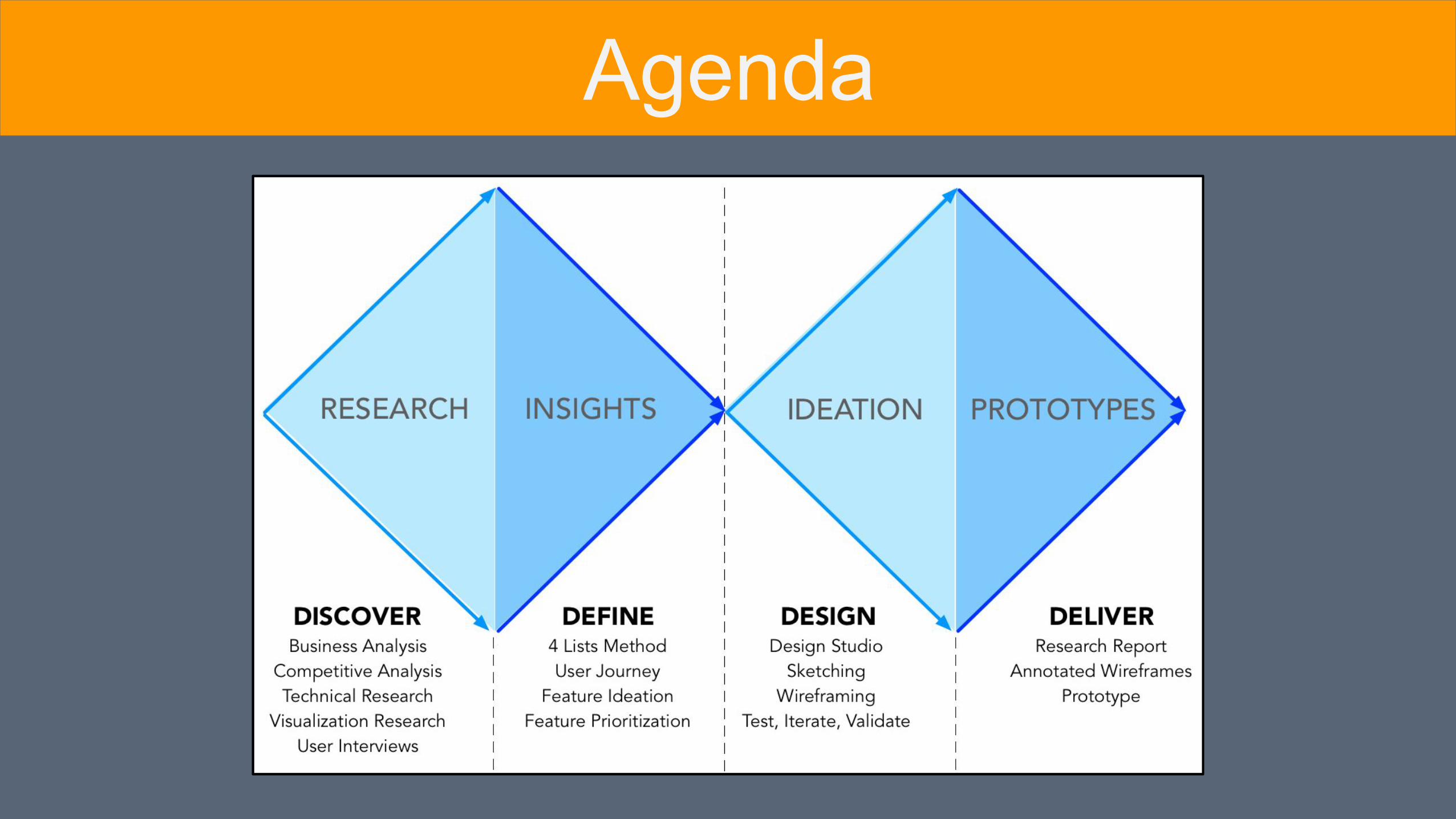
Agenda

Discovery
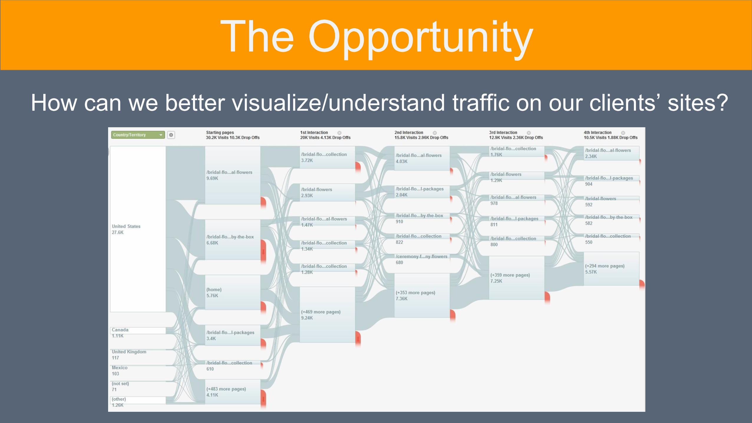
How can we better visualize/understand traffic on our clients’ sites?
The Opportunity

Research
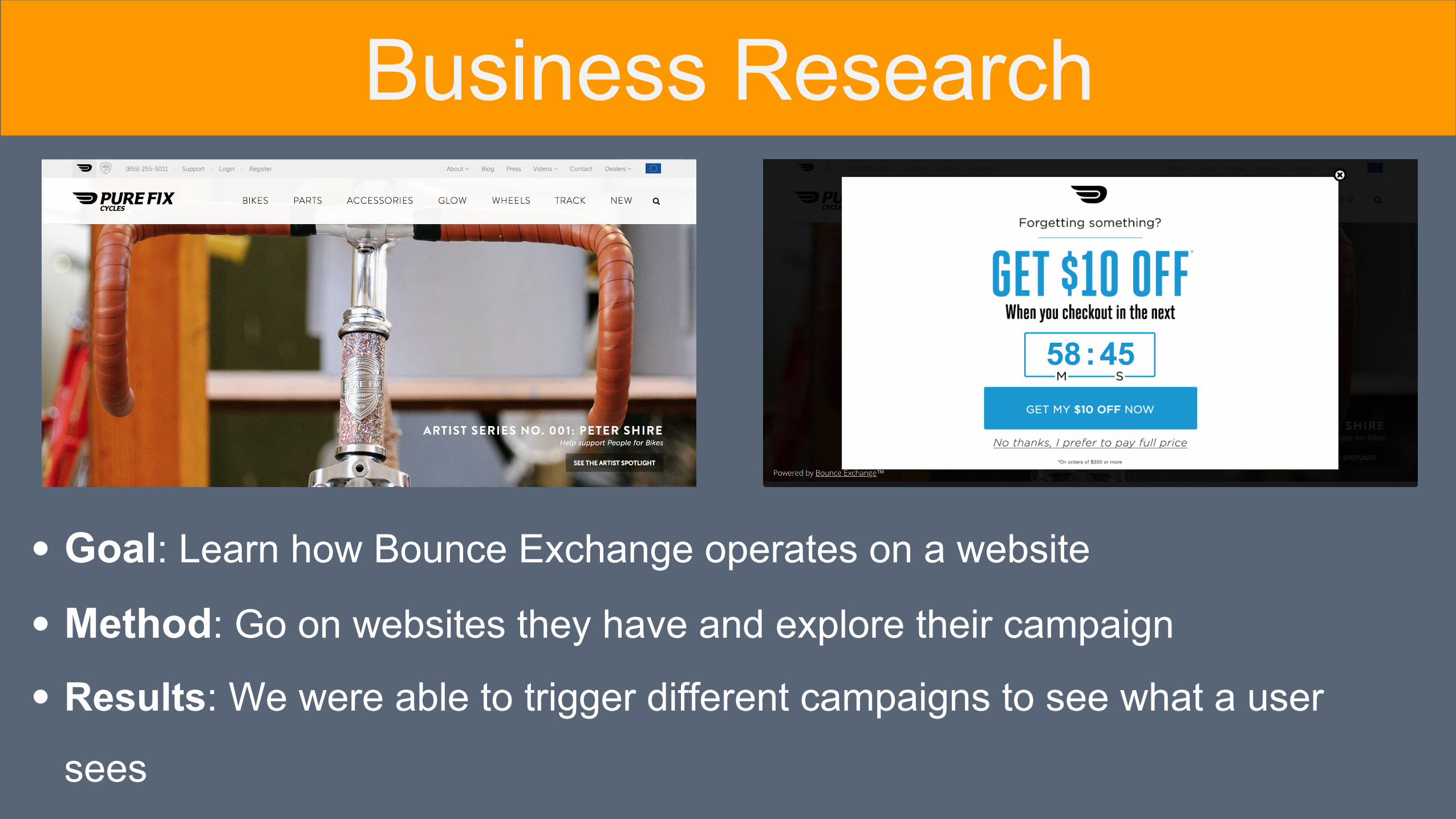
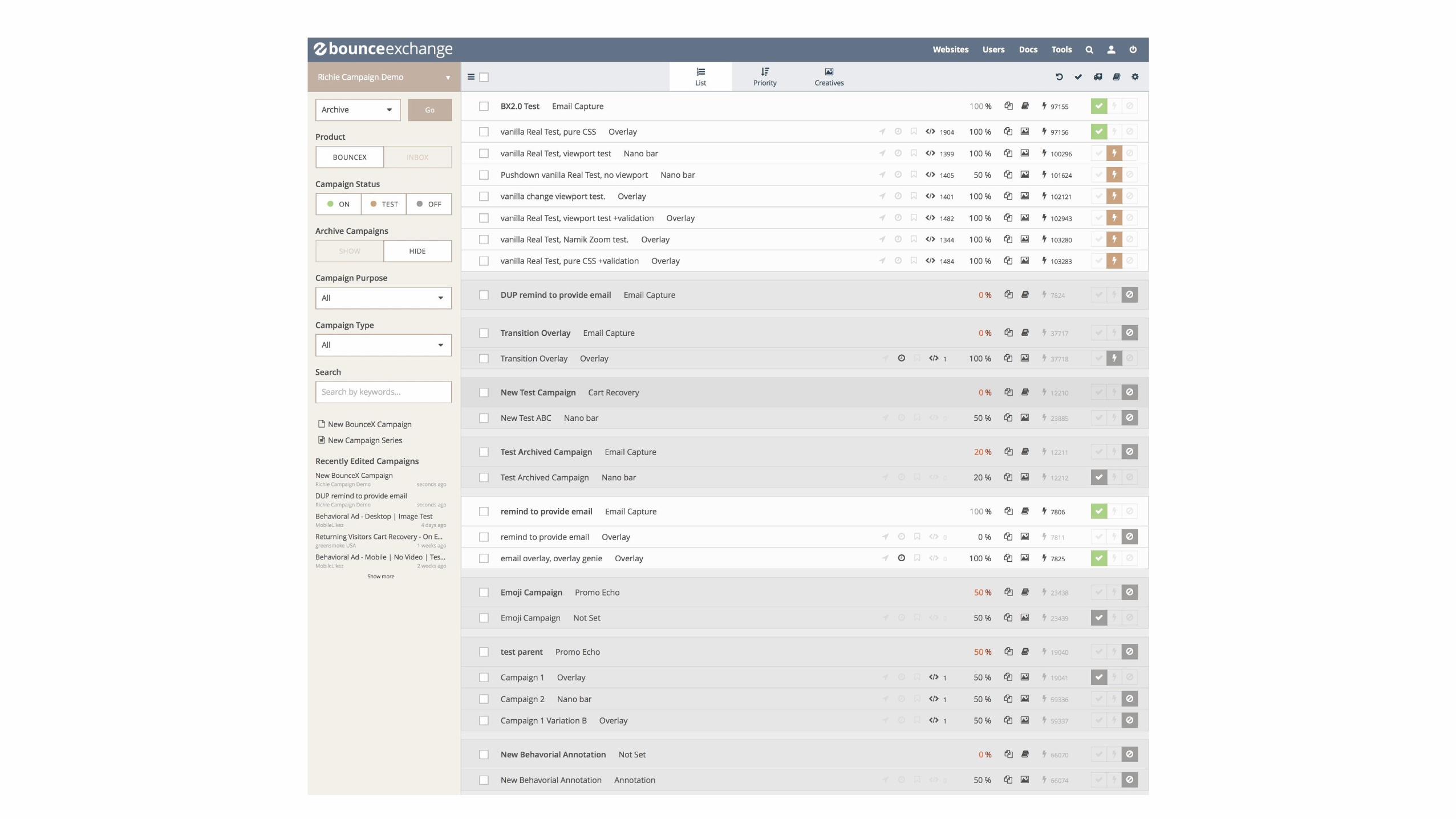
Goal: Learn how Bounce Exchange operates on a website
Method: Go on websites they have and explore their campaign
Results: We were able to trigger different campaigns to see what a user
sees
Business Research
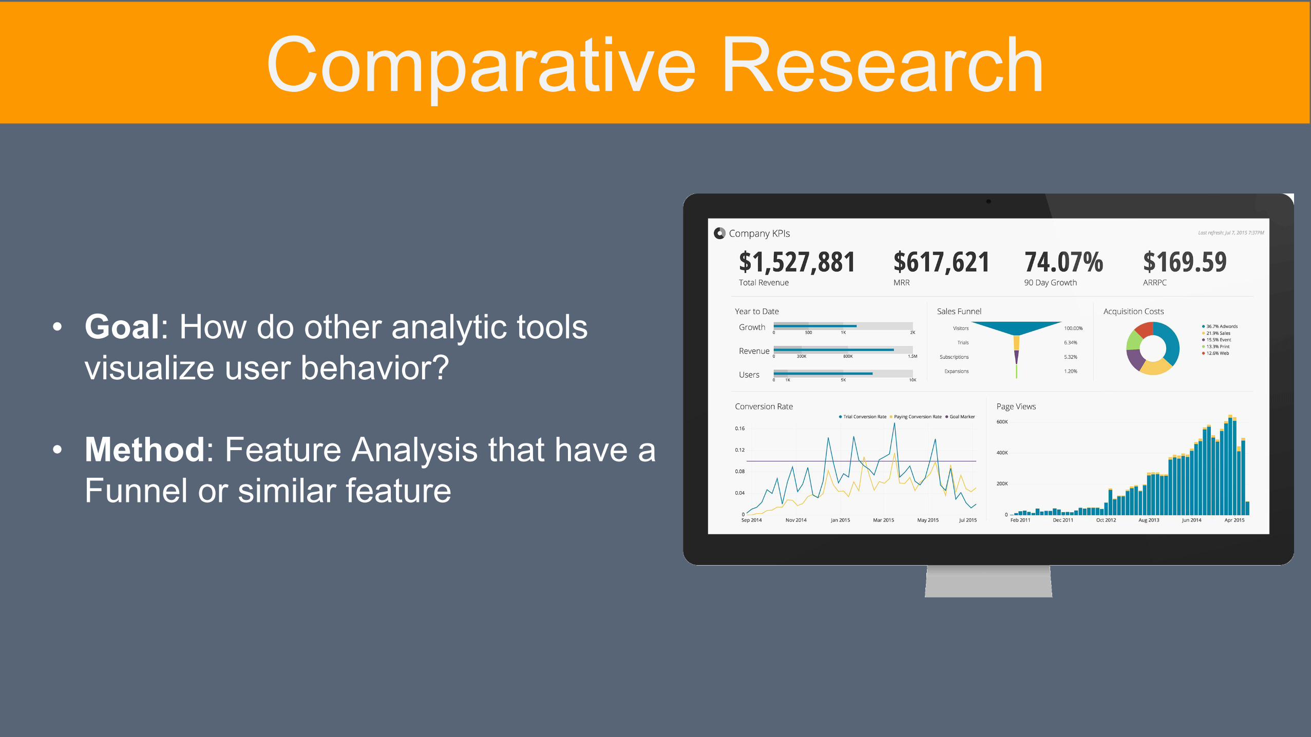
Comparative Research
• Goal: How do other analytic tools visualize user behavior?
• Method: Feature Analysis that have a Funnel or similar feature
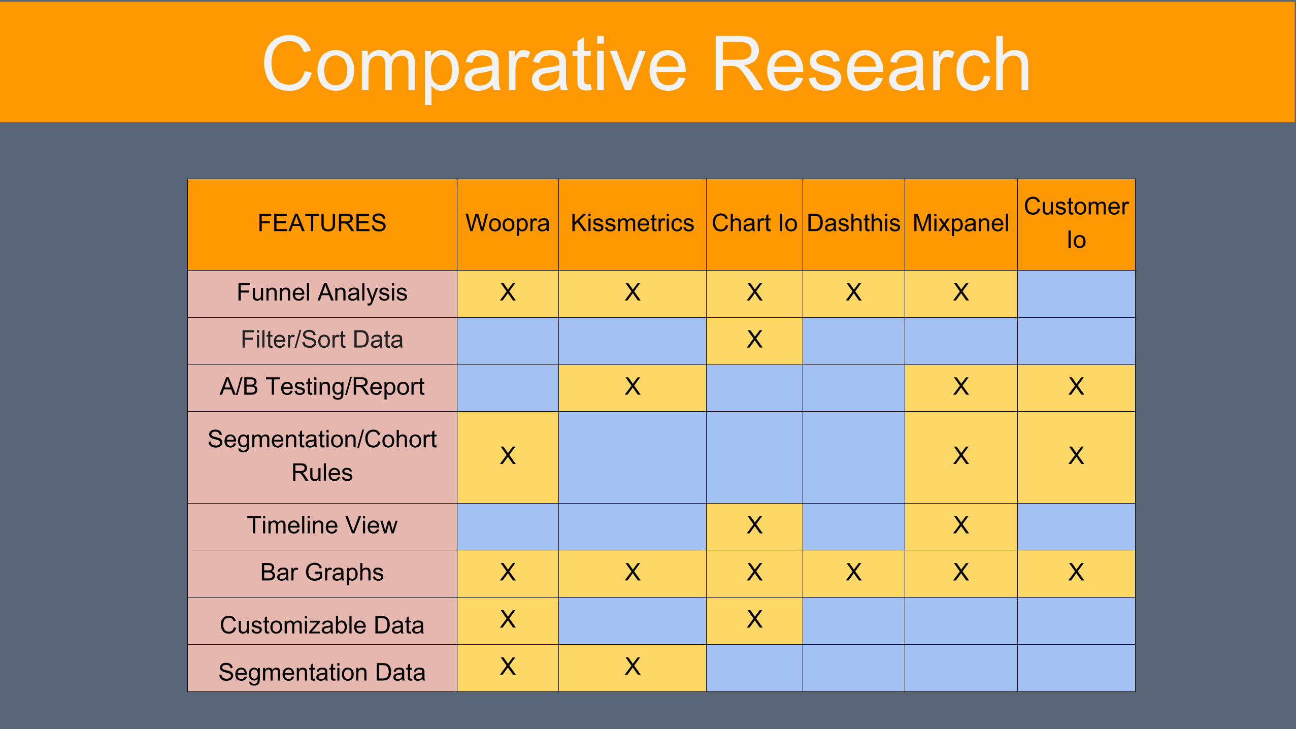
FEATURES Woopra Kissmetrics Chart Io Dashthis MixpanelCustomer
Io
Funnel Analysis X X X X X
Filter/Sort Data X
A/B Testing/Report X X X
Segmentation/Cohort Rules
X X X
Timeline View X X
Bar Graphs X X X X X X
Customizable Data X X
Segmentation Data X X
Comparative Research
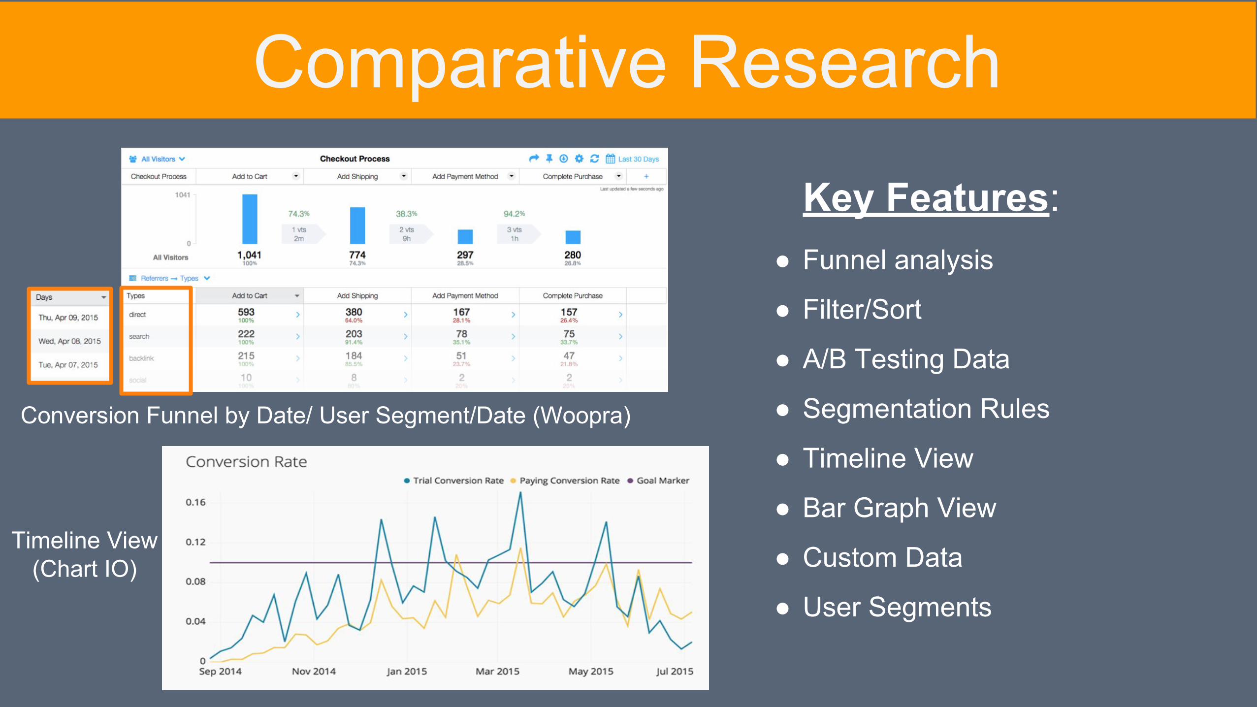
Conversion Funnel by Date/ User Segment/Date (Woopra)
Timeline View (Chart IO)
Key Features:
Comparative Research
● Funnel analysis
● Filter/Sort
● A/B Testing Data
● Segmentation Rules
● Timeline View
● Bar Graph View
● Custom Data
● User Segments
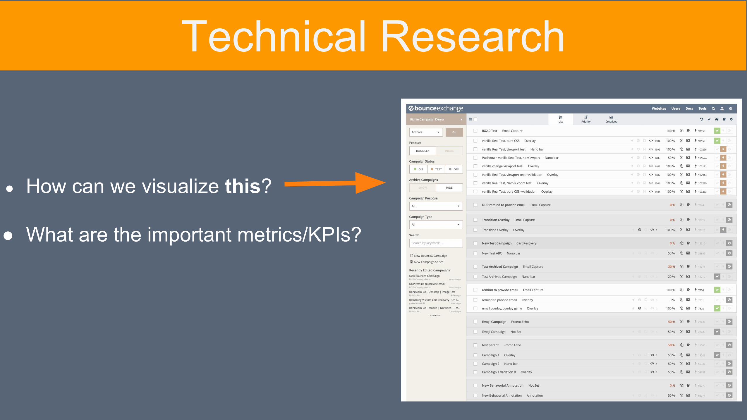
● How can we visualize this?
● What are the important metrics/KPIs?
Technical Research
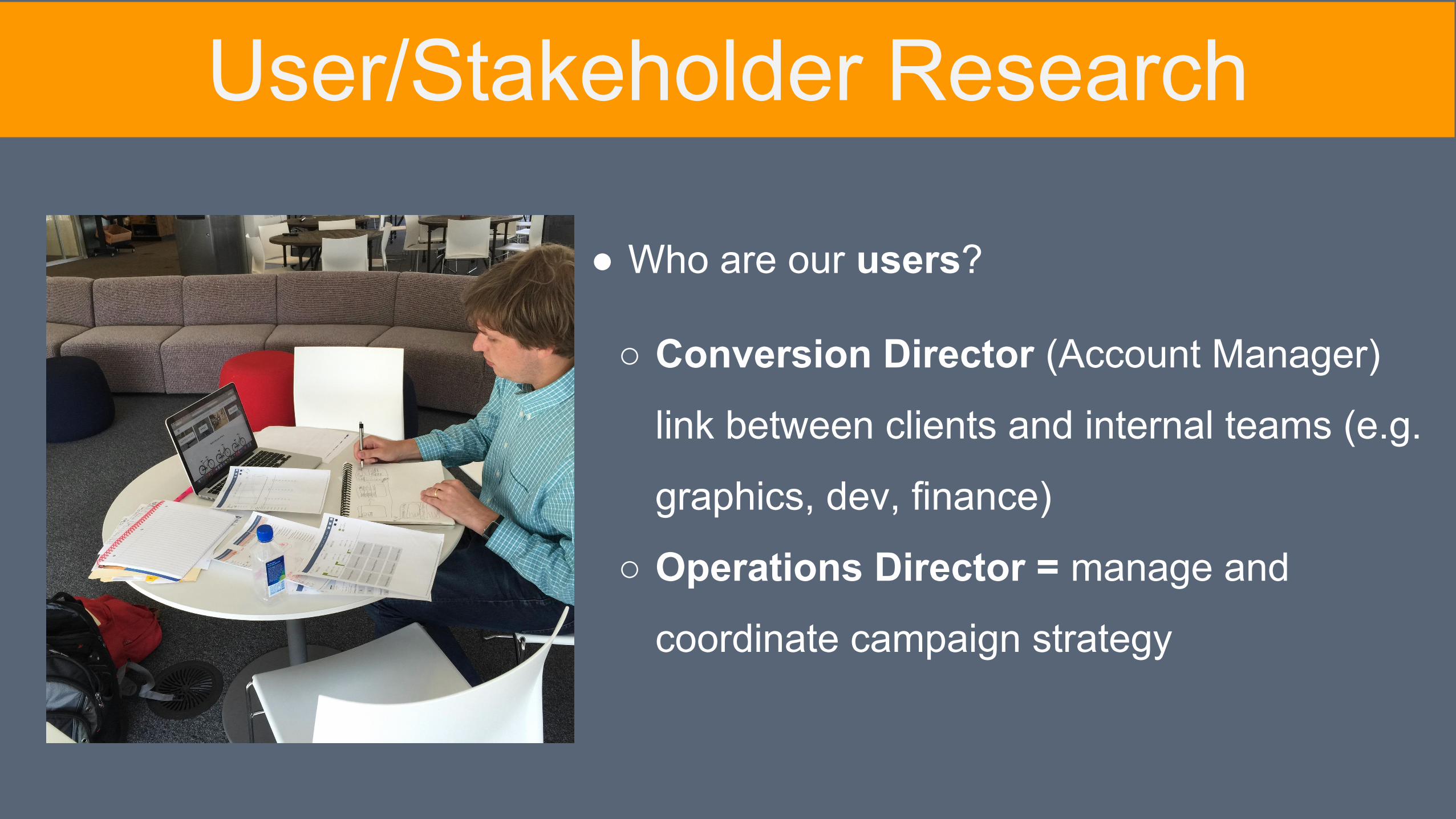
● Who are our users?
○ Conversion Director (Account Manager)
link between clients and internal teams (e.g.
graphics, dev, finance)
○ Operations Director = manage and
coordinate campaign strategy
User/Stakeholder Research
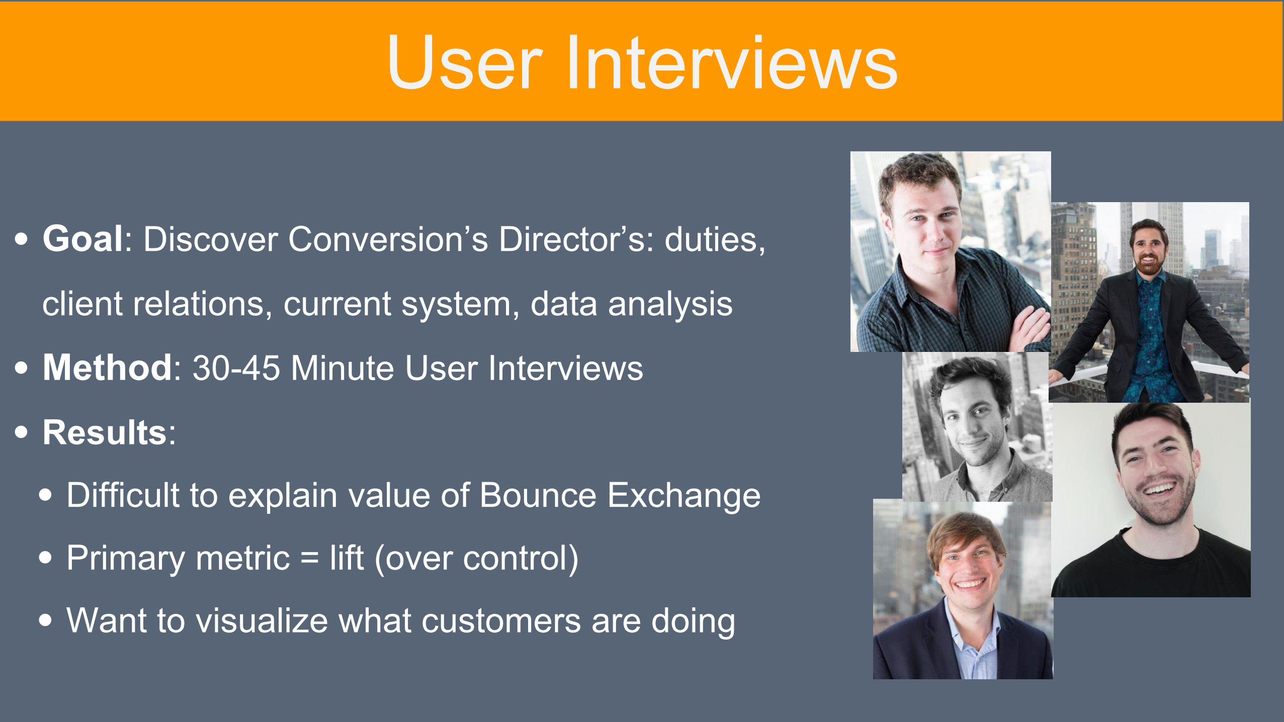
Goal: Discover Conversion’s Director’s: duties,
client relations, current system, data analysis
Method: 30-45 Minute User Interviews
Results:
Difficult to explain value of Bounce Exchange
Primary metric = lift (over control)
Want to visualize what customers are doing
User Interviews
Synthesis &
Definition
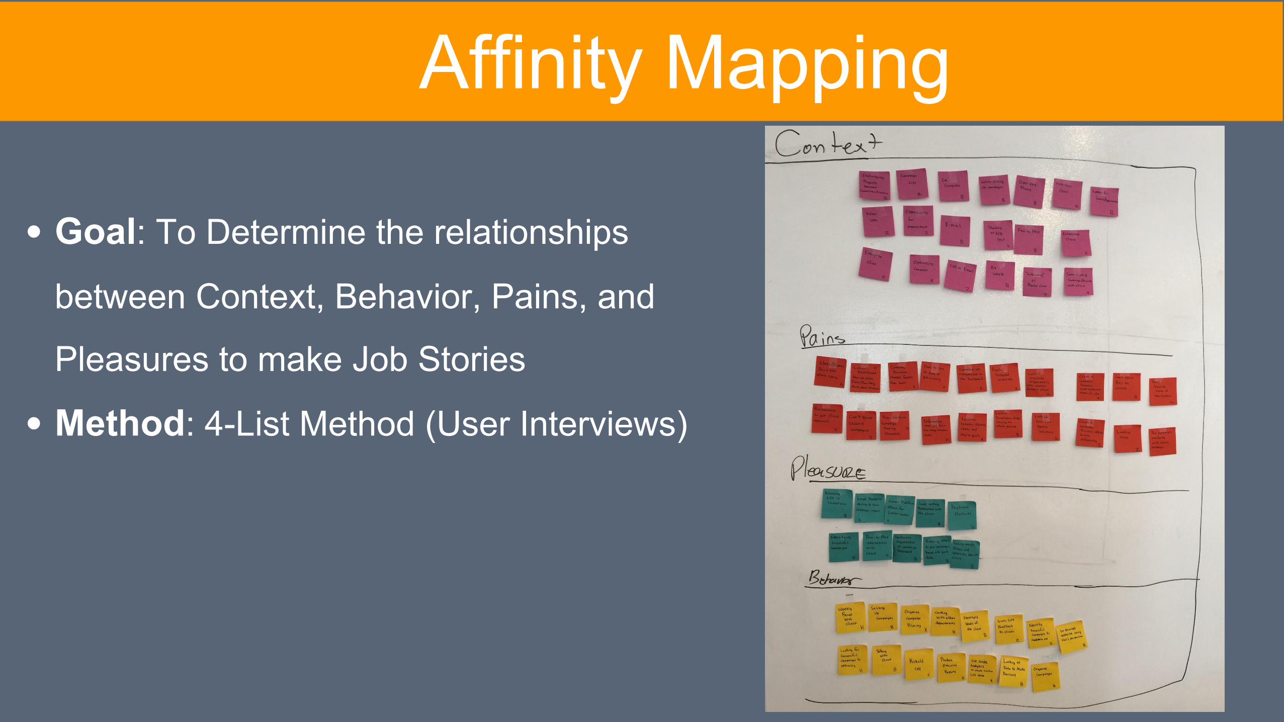
Goal: To Determine the relationships
between Context, Behavior, Pains, and
Pleasures to make Job Stories
Method: 4-List Method (User Interviews)
Affinity Mapping
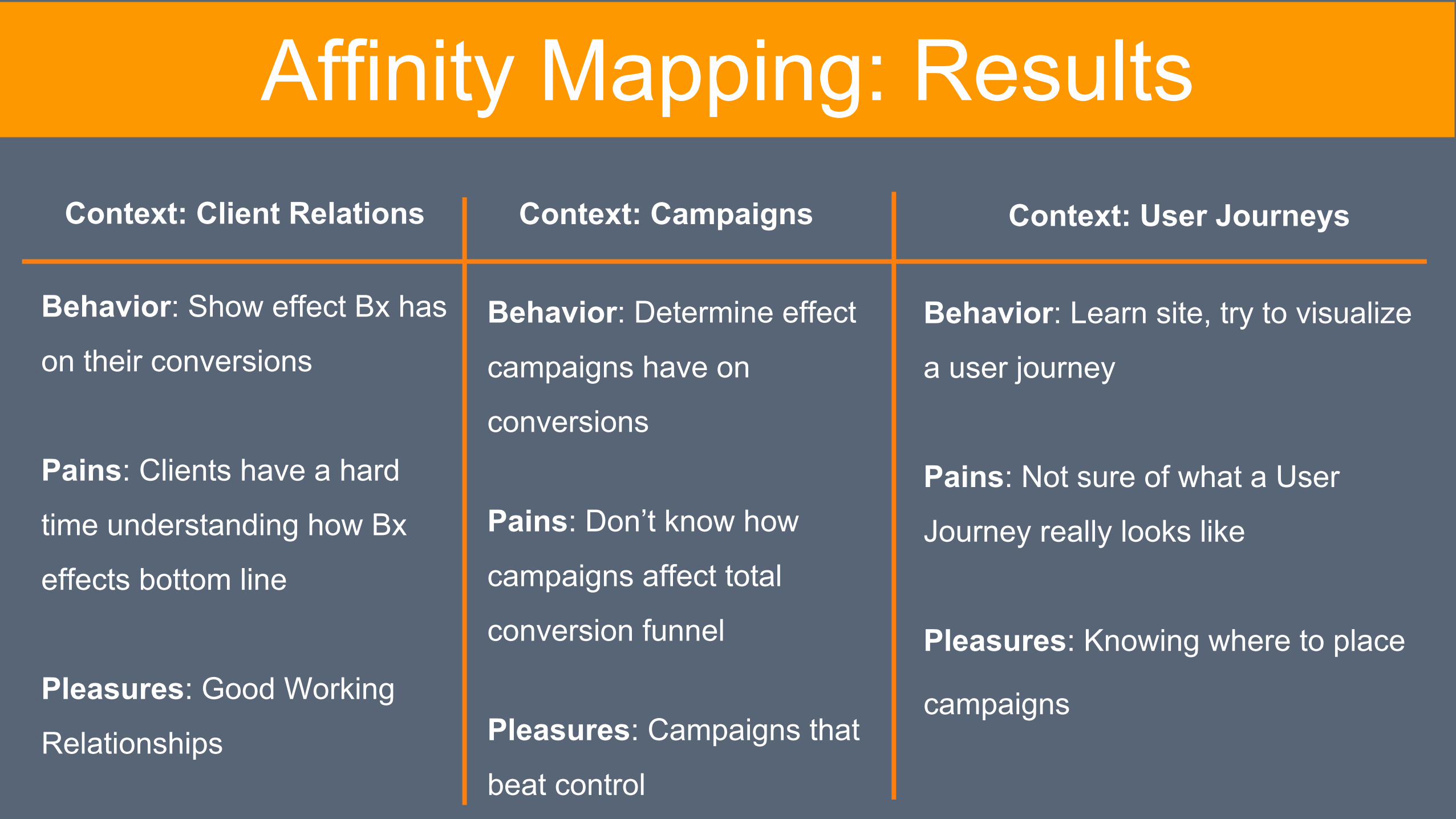
Behavior: Show effect Bx has
on their conversions
Pains: Clients have a hard
time understanding how Bx
effects bottom line
Pleasures: Good Working
Relationships
Affinity Mapping: Results
Behavior: Determine effect
campaigns have on
conversions
Pains: Don’t know how
campaigns affect total
conversion funnel
Pleasures: Campaigns that
beat control
Behavior: Learn site, try to visualize
a user journey
Pains: Not sure of what a User
Journey really looks like
Pleasures: Knowing where to place
campaigns
Context: Client Relations Context: Campaigns Context: User Journeys
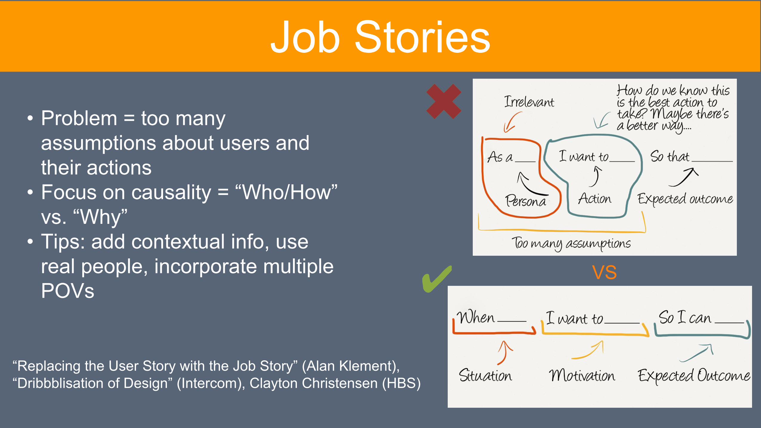
“Replacing the User Story with the Job Story” (Alan Klement), “Dribbblisation of Design” (Intercom), Clayton Christensen (HBS)
VS
• Problem = too many assumptions about users and their actions
• Focus on causality = “Who/How” vs. “Why”
• Tips: add contextual info, use real people, incorporate multiple POVs ✔
Job Stories
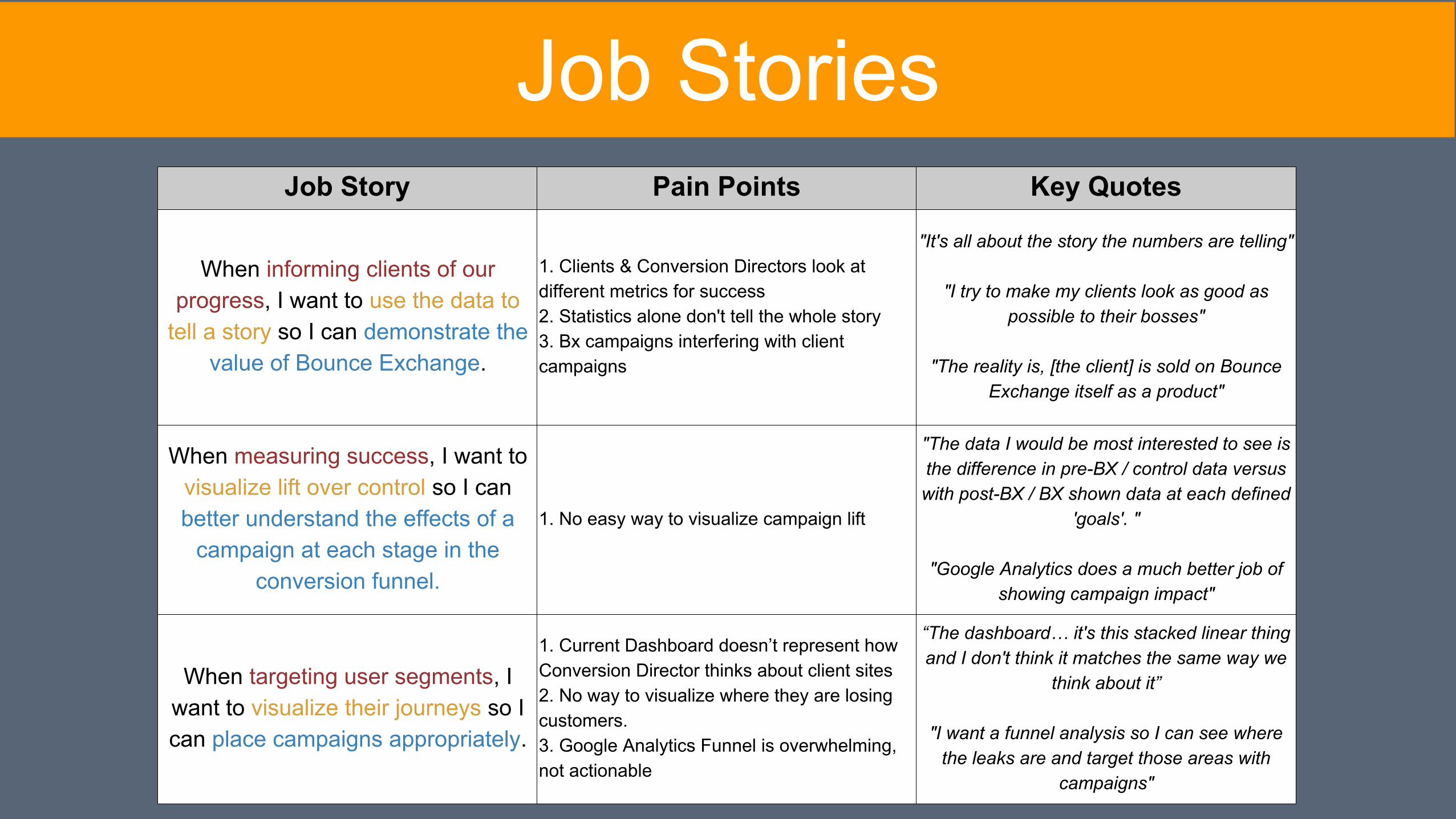
Job Story Pain Points Key Quotes
When informing clients of our progress, I want to use the data to
tell a story so I can demonstrate the value of Bounce Exchange.
1. Clients & Conversion Directors look at different metrics for success2. Statistics alone don't tell the whole story3. Bx campaigns interfering with client campaigns
"It's all about the story the numbers are telling"
"I try to make my clients look as good as possible to their bosses"
"The reality is, [the client] is sold on Bounce Exchange itself as a product"
When measuring success, I want to visualize lift over control so I can better understand the effects of a
campaign at each stage in the conversion funnel.
1. No easy way to visualize campaign lift
"The data I would be most interested to see is the difference in pre-BX / control data versus with post-BX / BX shown data at each defined
'goals'. "
"Google Analytics does a much better job of showing campaign impact"
When targeting user segments, I want to visualize their journeys so I can place campaigns appropriately.
1. Current Dashboard doesn’t represent how Conversion Director thinks about client sites2. No way to visualize where they are losing customers.3. Google Analytics Funnel is overwhelming, not actionable
“The dashboard… it's this stacked linear thing and I don't think it matches the same way we
think about it”
"I want a funnel analysis so I can see where the leaks are and target those areas with
campaigns"
Job Stories
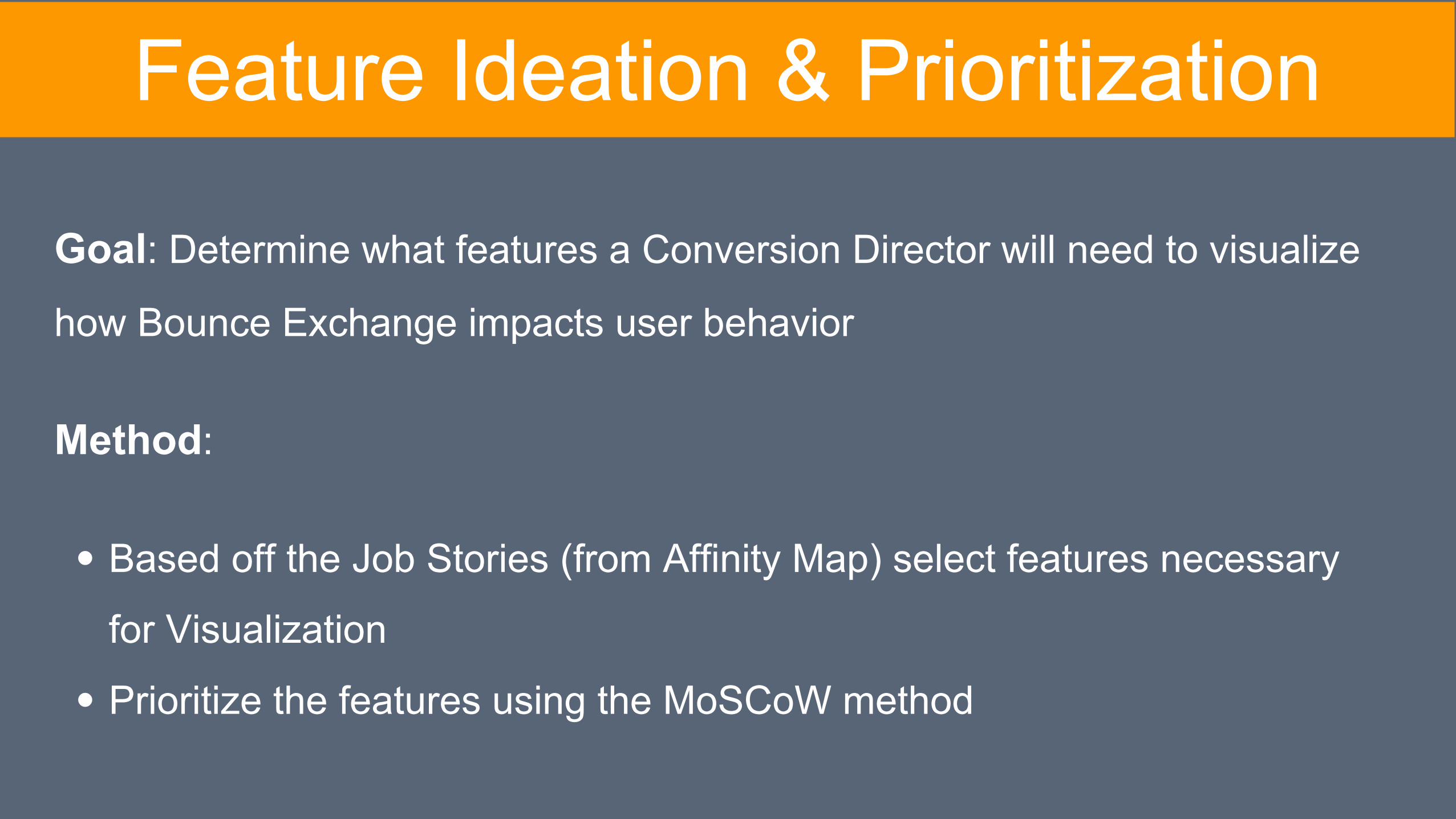
Feature Ideation & Prioritization
Goal: Determine what features a Conversion Director will need to visualize
how Bounce Exchange impacts user behavior
Method:
Based off the Job Stories (from Affinity Map) select features necessary
for Visualization
Prioritize the features using the MoSCoW method
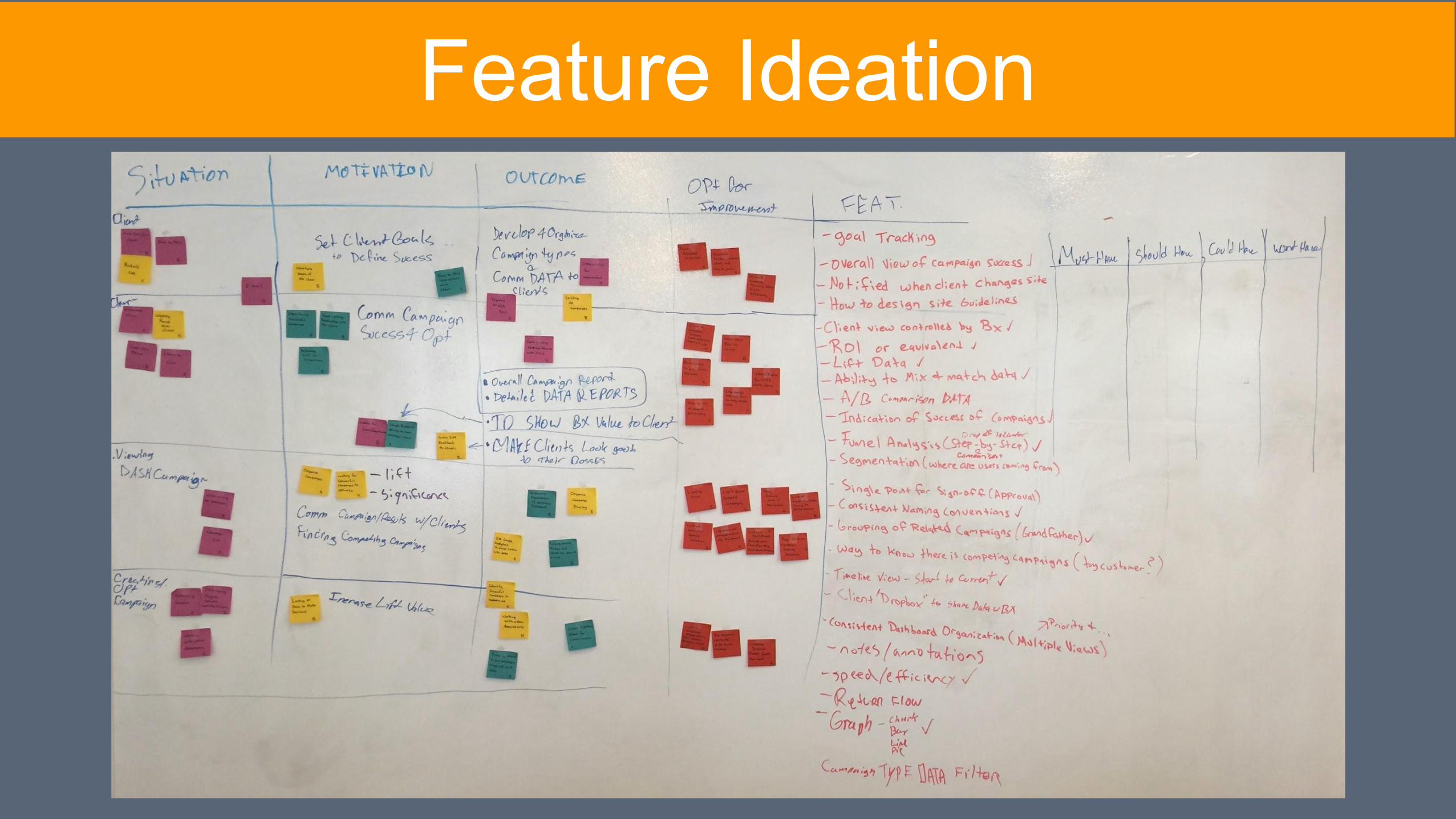
Feature Ideation
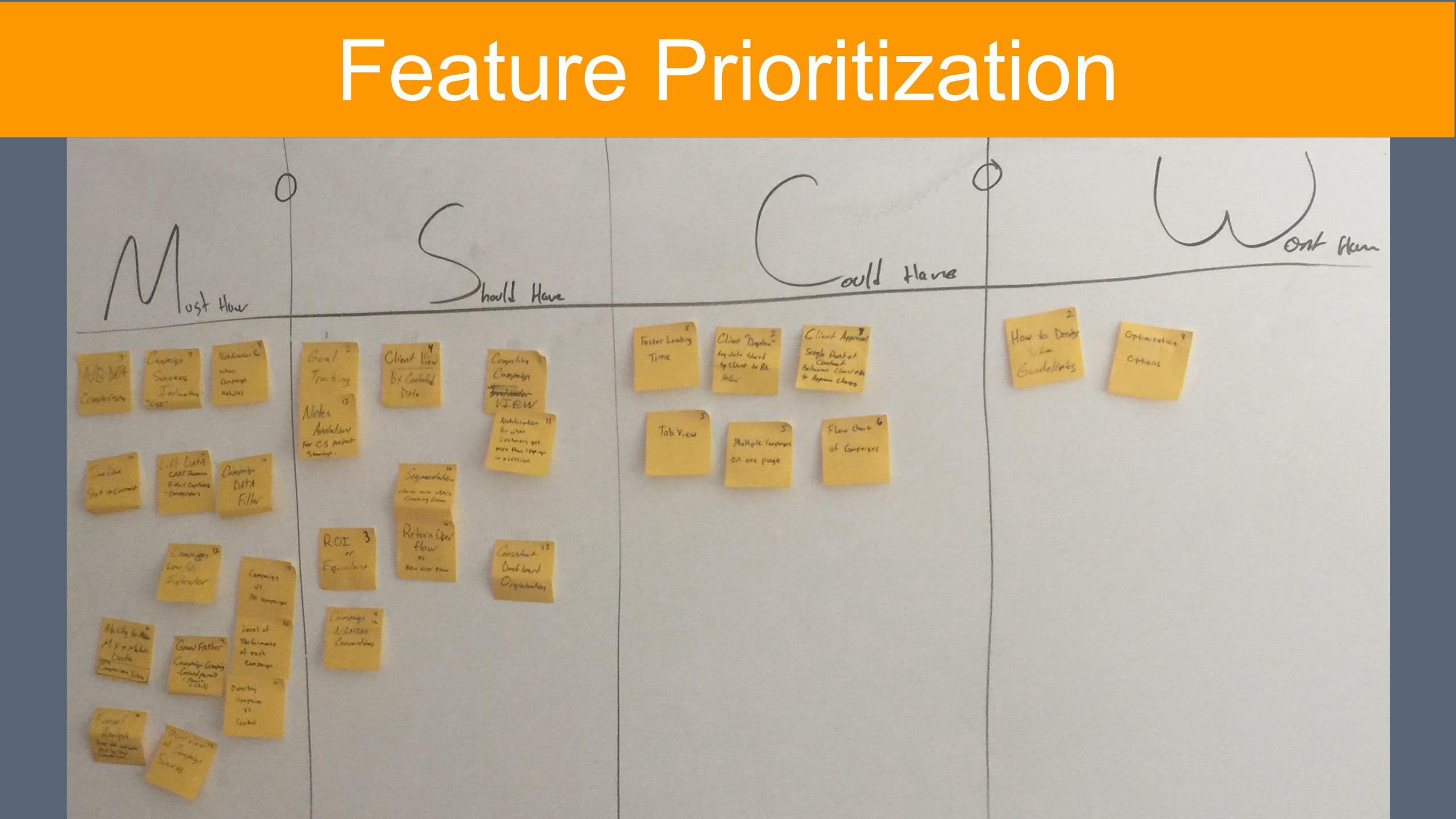
Feature Prioritization
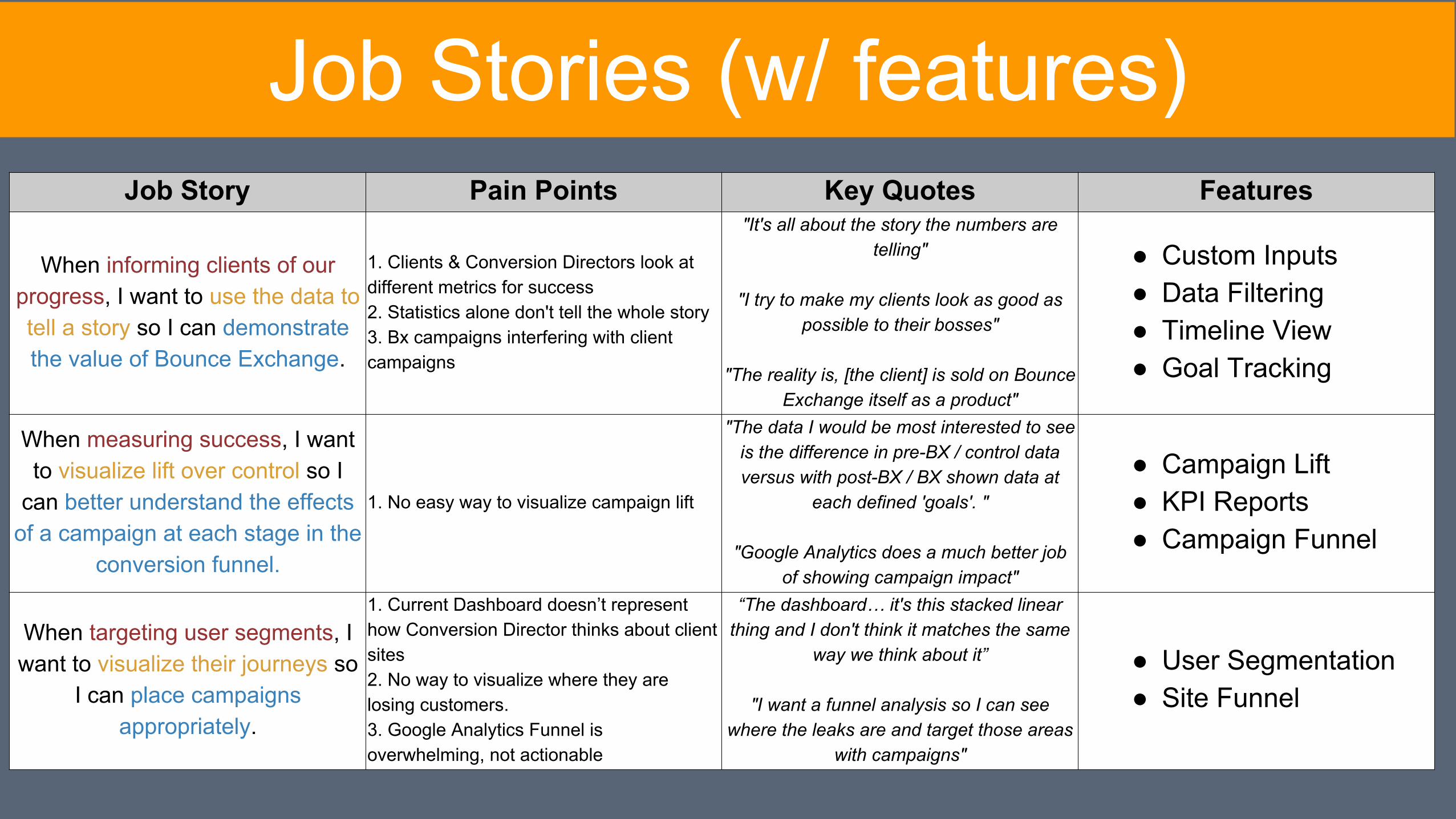
Job Story Pain Points Key Quotes Features
When informing clients of our progress, I want to use the data to tell a story so I can demonstrate the value of Bounce Exchange.
1. Clients & Conversion Directors look at different metrics for success2. Statistics alone don't tell the whole story3. Bx campaigns interfering with client campaigns
"It's all about the story the numbers are telling"
"I try to make my clients look as good as possible to their bosses"
"The reality is, [the client] is sold on Bounce Exchange itself as a product"
● Custom Inputs ● Data Filtering● Timeline View ● Goal Tracking
When measuring success, I want to visualize lift over control so I
can better understand the effects of a campaign at each stage in the
conversion funnel.
1. No easy way to visualize campaign lift
"The data I would be most interested to see is the difference in pre-BX / control data versus with post-BX / BX shown data at
each defined 'goals'. "
"Google Analytics does a much better job of showing campaign impact"
● Campaign Lift● KPI Reports● Campaign Funnel
When targeting user segments, I want to visualize their journeys so
I can place campaigns appropriately.
1. Current Dashboard doesn’t represent how Conversion Director thinks about client sites2. No way to visualize where they are losing customers.3. Google Analytics Funnel is overwhelming, not actionable
“The dashboard… it's this stacked linear thing and I don't think it matches the same
way we think about it”
"I want a funnel analysis so I can see where the leaks are and target those areas
with campaigns"
● User Segmentation● Site Funnel
Job Stories (w/ features)
Design
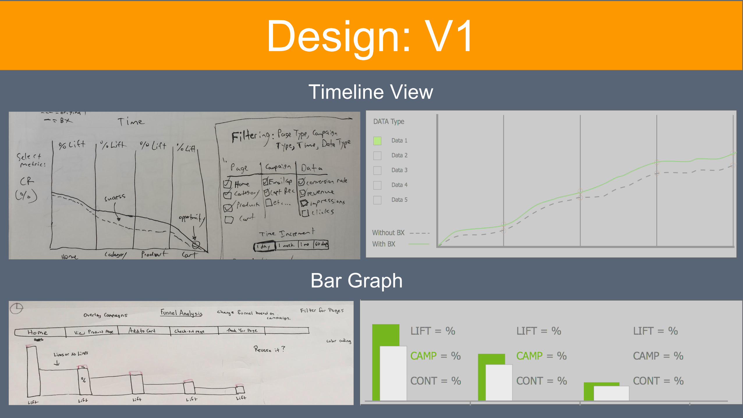
Design: V1Timeline View
Bar Graph
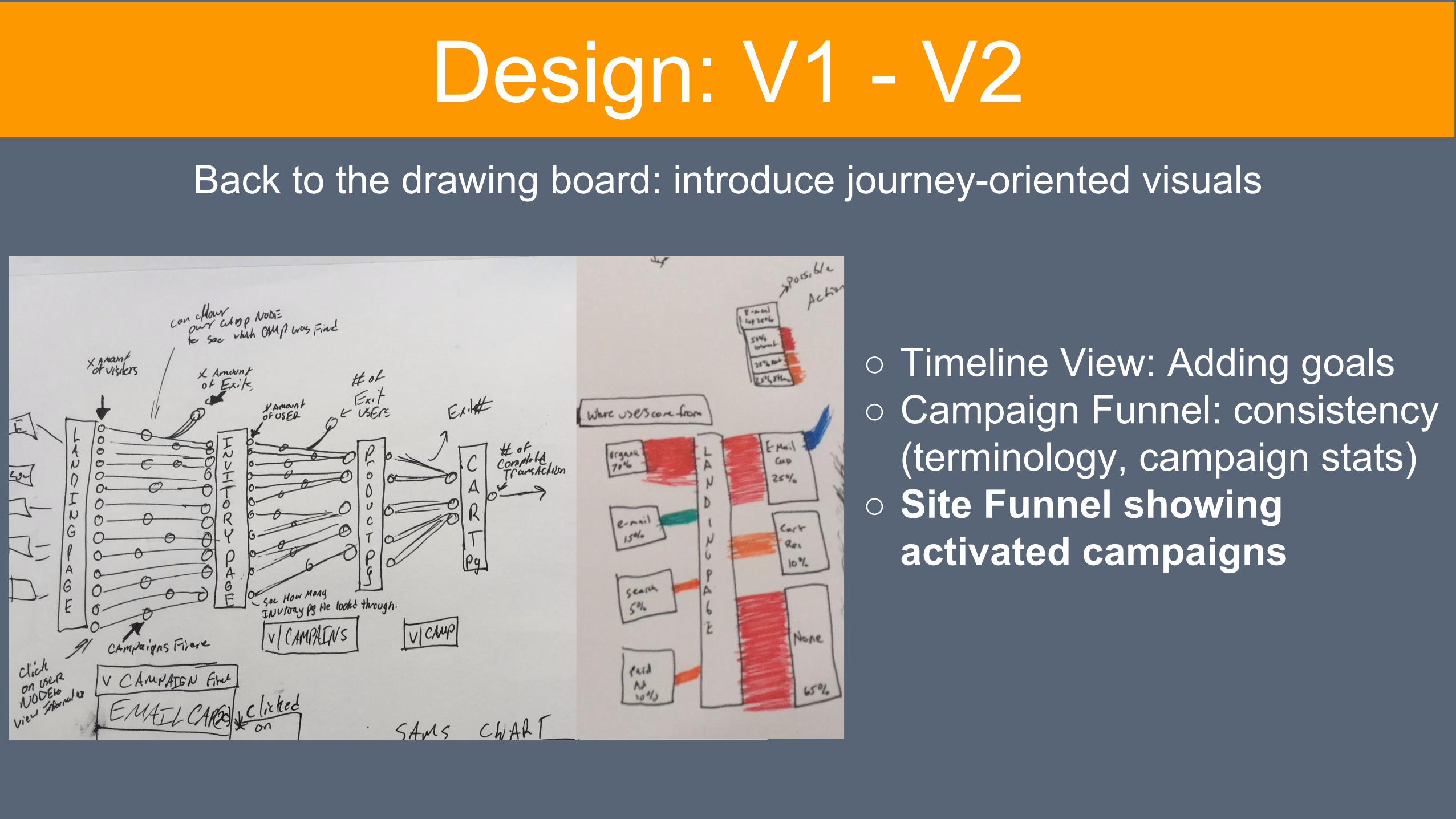
Back to the drawing board: introduce journey-oriented visuals
Design: V1 - V2
○ Timeline View: Adding goals ○ Campaign Funnel: consistency
(terminology, campaign stats) ○ Site Funnel showing
activated campaigns
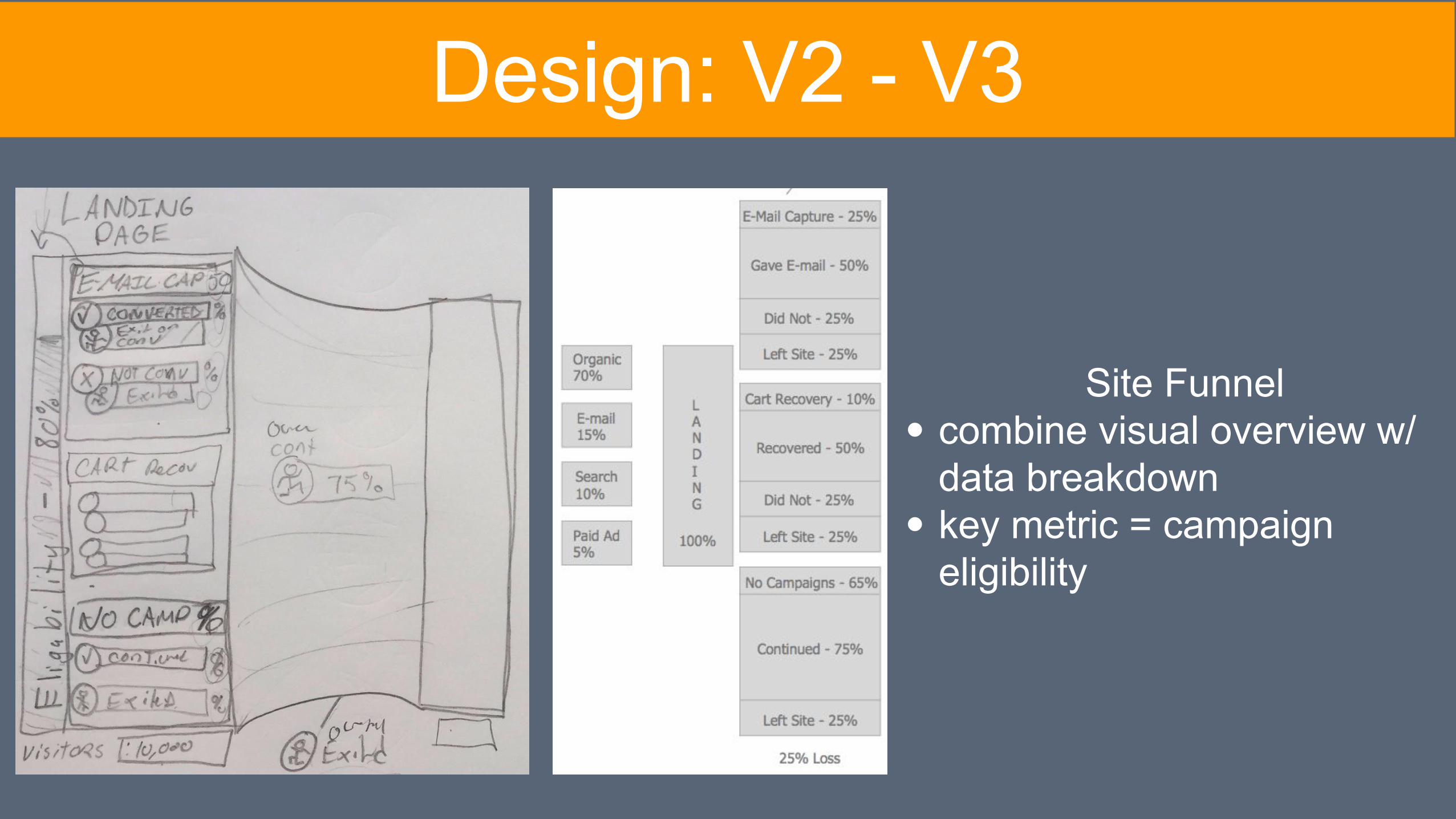
Design: V2 - V3
Site Funnelcombine visual overview w/ data breakdownkey metric = campaign eligibility
Prototype
BOUNCE EXCHANGE
Recap
● Challenges: ○ Time & Scheduling ○ Understanding Key Terms & Business Principles
● What Did We Learn? ○ Data Visualization○ Conversion Director E-Commerce Strategies○ New Vocabulary
● How does this solve the problem? ○ Integrated a new dashboard feature to give
Conversion Director simple and informative way to visualization their site/user data
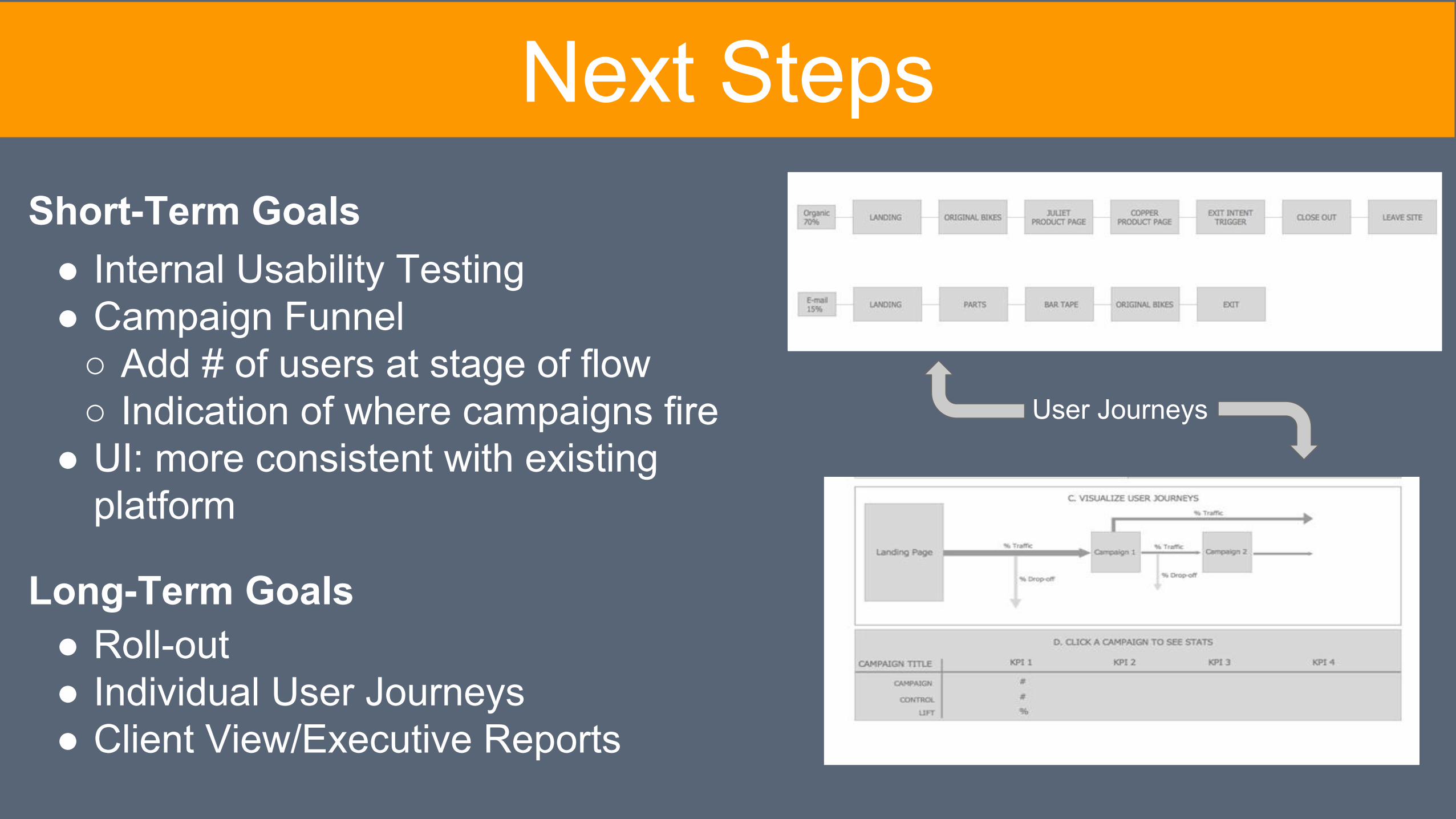
Next StepsShort-Term Goals
● Roll-out ● Individual User Journeys● Client View/Executive Reports
Long-Term Goals
● Internal Usability Testing ● Campaign Funnel
○ Add # of users at stage of flow○ Indication of where campaigns fire
● UI: more consistent with existing platform
User Journeys